What I really like about the final cover chosen for this non-fiction book is that it defies the clichés for the genre - open roads, big skies, dramatic scenery. I presented a couple of those as options, as you can see below, but in the end the choice was made to go for a more conceptual approach that gets to the heart of the story of an iron butt who rides his motorcycle non stop from Alaska to the Florida panhandle, averaging about 1500 miles a day. I wanted the cover to convey the obsessive nature of the quest, without necessarily showing the motorcycle. The author suggested having the odometer show the actual increases in mileage as day moved to night and back again.


This is a logo I am working on for a violin maker.

Forkhill Protestants, Forkhill Catholics

A social history of protestants and catholics in Forkhill parish on the Ulster borderlands between 1787 and 1858. The author contends that there was a greater degree of cooperation and exchange between Catholics and Protestants than the historical record has acknowledged. One house, two chimneys, both faiths.

Journals

I have done a couple of journal redesigns recently and love the challenge of showing "different but the same" as my old boss used to say. The treatment is based on the cover of XXe Siecle magazine from 1938 (below).


I was backing up some old covers and came across this one again. The biggest pitfall when doing scholarly books are those wordy titles and subtitles - how to manage all that type. I love it when they keep it to a minimum like this.

Blogger was having technical problems yesterday and this post got deleted.

One of my favourite presses is celebrating their 50th year. They were among my first clients and I have been doing their covers for the last 15 years - roughly 120 and counting. This is their current catalogue cover that I just designed.

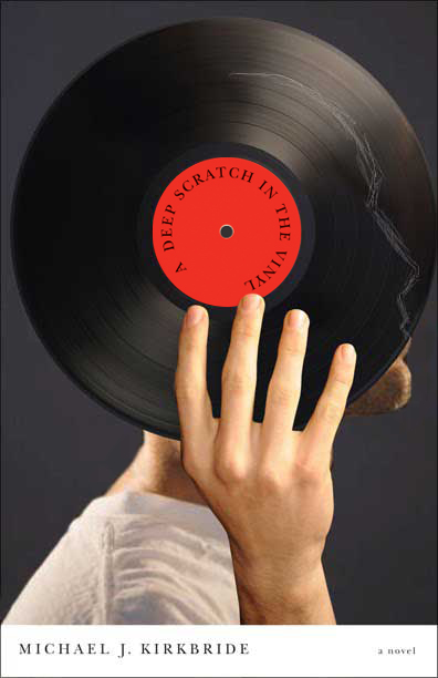
This novel has lots of rock and roll references and deals with the tragic end of a friendship. I like the fact that a scratch on an album is like a memory that can’t be erased.


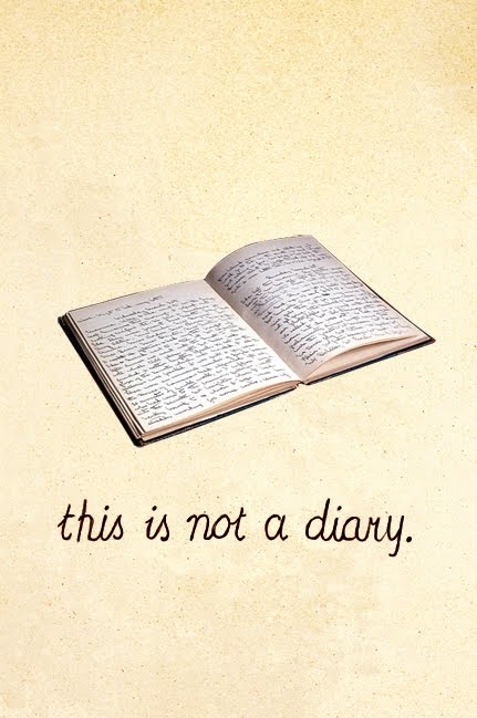
This is for a cover I am working on that is a diary but not in the typical autobiographical sense. The title reflects that in a tongue-in-cheek manner. I immediately thought of that iconic Magritte painting.


This is an illustration for a book cover I am working on. The photographs supplied were all black and white and the publisher wanted to jazz it up a bit.


Work in progress

Cover art for a scholarly book that deals with the problems that arise when Identity driven theories of group rights are relied on to settle legal claims.

Men’s Health Magazine

work in progress

This one was fun to work on. Poetry cover as boxing poster. The first one featured a heart but was off the mark. The poems are more about the poet boxing with herself.


Off to the printer.

This one went through a couple of options before getting it right. Written after a near-fatal medical emergency, the poems express gratitude at being alive but are also undercut by confusion and ambivalence with an acute sense of mortality.The "gift horse" is existence itself.


work in progress

From a cover design on rural schools in China in the early 1900's in the morning to a design for a flour bag the afternoon. All in a days work.

work in progress

Unused illustration for an article on crying at the office.

We have had a total of 6 dogs since we moved out to the farm in 1995, and actually just acquired another stray we found curled up in a snowbank on the side of the road. This door shows part of that history. Two rotten westies were responsible for the scratches below the handle and my friend Beau for the ones above it.

work in progress

work in progress

I think for this one I was really just looking for an excuse to buy that Strangelove font.

This is the secondary illustration for the same article below.

logo project in progress

I am working on this logo for my local library. The library is no longer little and it isn't green anymore so the challenge was to find a way of showing both the history of the library while also highlighting the fact that it has moved into a new larger facility.

Men’s Health Magazine


This is my current wallet used in an Illustration for the April issue of Men's Health. My old wallet made an appearance on a book cover.

work in progress


source image

This image was developed for another cover that was never used. It just seemed right for this book.

work in progress

Another one for the Salon des refusés

He has a reputation as one Canada's worst Prime Ministers - perhaps undeservedly so. In the end we decided to go in a different direction.

New Series

I am working on this series of books dedicated to municipal government. There will be 6 in all, each with a different configuration of coloured blocks which represents the contours/grid of a municipality.


Casual Optimist

The inimitable Dan Wagstaff at the Casual Optimist did an interview with me about my work.

I was backing up some old files and found this unpublished illustration I did for a piece on selling condoms to children.