


This is a photo illustration I just did for the New York Times Magazine. It is part of their "key" series where they ask designers to interpret what "key" means to them. From the initial brief: "Many artists and designers have found it useful to come at this project from a personal vantage point using their own personal keys or places they’ve lived or buildings that have meaning to them as a starting point."
I had two directions that I felt were strong but were still lacking the personal hook. The first showed the impression of my house key in my wallet. The second was a collection of key chains.


I decided to create a three dimensional key with parts of my home that had meaning for me and defined where I live. Among the objects there is a Quebec license plate, an old fishing thermos that belonged to my grandfather, a kilt with the Drummond tartan, a glass door knob, an old milk bottle (I live in a dairy farming part of Quebec) and the actual key for the front door to my house. The whole thing is held together by baler twine which is the duct tape of working farms. The final photo was taken by the amazing Tom Schierlitz.

A selection of other keys in the series


More Flys
Approval pending
Suggestion was made to show an apple pie with more flys than I had on the cupcake

Suggestion was made to show an apple pie with more flys than I had on the cupcake

approval pending
First sketch was rejected. Once I got my hands on the actual recipes I knew there was a way to use them on the cover.

First sketch was rejected. Once I got my hands on the actual recipes I knew there was a way to use them on the cover.


This is for a cover I am working on now. The book deals with junk DNA. From the brief: "...that most of culture and nature, including humans, are primarily composed of useless material." If we go with this direction I will have to photograph a collection of boxes but this sketch gives the general idea.


New Camera
After 10 years I figured it was time to buy a new camera. The old one certainly paid for itself. I picked up these bugs in a store and just know there is a book cover waiting for them. Just have to bide my time.


Hot off the press
 Sometimes you totally luck out with a Royalty Free image. When I downloaded the low res image for the sketch I didn't realize that there was this cool dot pattern running throughout it.


This is a three volume biography of the life of Samuel de Champlain from his early years in France to all of his voyages to the new world. For me the challenge with this kind of material is how to present it in a fresh way. I thought it would interesting to use the same portrait of Champlain going from far to close - France to New France.


approval pending
I designed this cover a couple of years ago.

I knew there would be a second companion book down the line but put off working the details of how they would fit together until later. Well later finally arrived. I like these kind of challenges. You have to work within certain parameters but still find a creative solution.
Both books deal with history of imperialism, capitalism and decolonization. From the brief : “the American empire of possessive individualism” with its pervasive monoculture of corporate privatization” that incorporated Indian territory into ‘the ethos and laws of the empire of private property.”
I picked up on the horizontal bands from the American flag in the first volume, by showing horizontal plots of fenced-off land.

Elgin Identity
I recently did the identity for the small town where I live. Even though I have been doing this for a while I still get a kick out of seeing my work in a bookstore or in this case on the side of a truck.


Brain Books
I seem to have found a niche doing covers about the brain. This is one that I am working on now about debilitating head aches. We are going in a different direction now but I thought this one was interesting.


Last Cover Sketch of the Decade
Approval Pending
The book deals with the final less humorous years of Twain's life

I thought it would interesting to put his portrait on the spine.

The book deals with the final less humorous years of Twain's life

I thought it would interesting to put his portrait on the spine.

Christmas 2009
Beau was hit by a car just before Christmas and after a week in the animal hospital spent the holidays convalescing on the living room floor. Our other dog isn't up for long walks in the snow so up on my shoulders she goes.


Another Way the River Has
Robin Cody
The author recommended this photo for the cover of the book:

The risk was that the cover might look too sentimental or clichéd but I thought there could be an interesting way of making the splashes interact with the title. The photo was manipulated quite a bit to make everything fit. I changed the shirt colour as well to give it a bit more punch.

The author was asked to write 44 letters about the modern world for the Italian daily newspaper, La Republicca which published them serially. The letters capture a world which is in a constant state of flux. The number 44 is made up of the falling letters.


I wasn't sure how I was going to photograph this one to convey the feeling of falling envelopes. I actually started to construct a mobile of envelopes that I was going to photograph from below and then I thought there might be an easier way.


I wasn't sure how I was going to photograph this one to convey the feeling of falling envelopes. I actually started to construct a mobile of envelopes that I was going to photograph from below and then I thought there might be an easier way.

Series, series, series....
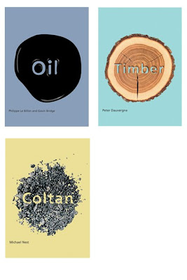
We all have to do them once in a while and it is always a challenge. This one is about the geopolitics of resources. I wanted to create a very simple, bold, graphic look for this. The global aspect comes through in the circular element on each cover where the resource is featured.


Managed Annihilation
Dean Bavington
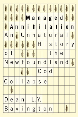
From the brief: The commercial cod fishery in Newfoundland and Labrador was once the most successful in the world. When it collapsed in 1992 – causing the largest single-day layoff in Canadian history and irrevocable ecological damage – fishermen, scholars, and scientists pointed to the state management of the fishery as the cause.

From the brief: The commercial cod fishery in Newfoundland and Labrador was once the most successful in the world. When it collapsed in 1992 – causing the largest single-day layoff in Canadian history and irrevocable ecological damage – fishermen, scholars, and scientists pointed to the state management of the fishery as the cause.
Circus
Michael Harris
This is the rough sketch that was approved. I am going to have to photograph the detritus in the foreground and integrate it a bit better. It wasn't on the original image.

This is the rough sketch that was approved. I am going to have to photograph the detritus in the foreground and integrate it a bit better. It wasn't on the original image.


Subscribe to:
Posts (Atom)


