


Mr Charlotte Brontë
Alan H. Adamson
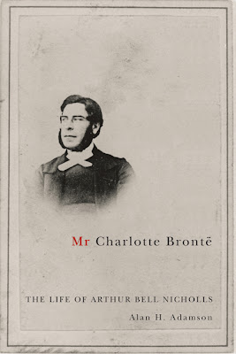
This is an upcoming 2008 biography of the vilified husband of Charlotte Brontë. Few people seeking to avoid the glare of publicity have had more of it turned on them than Arthur Bell Nicholls.
Often as a cover designer you are presented with a photograph or portrait that has to appear on the cover. Whenever possible I try to use it in a creative way. The portait of Nicholls is actually centered but I found that by reducing him and moving him to the left it suggested the presence of another person.
On the cover below I had to use this portrait of Leonid Andreev. I put his likeness on a wall in a suitably bleak Russian interior.


This is an upcoming 2008 biography of the vilified husband of Charlotte Brontë. Few people seeking to avoid the glare of publicity have had more of it turned on them than Arthur Bell Nicholls.
Often as a cover designer you are presented with a photograph or portrait that has to appear on the cover. Whenever possible I try to use it in a creative way. The portait of Nicholls is actually centered but I found that by reducing him and moving him to the left it suggested the presence of another person.

On the cover below I had to use this portrait of Leonid Andreev. I put his likeness on a wall in a suitably bleak Russian interior.


Freedom of Expression
Kembrew McLeod
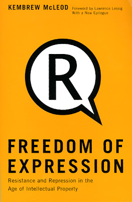
From the back cover: “...intellectual property laws have stifled creativity as they have been used to privatize all forms of expression–from guitar riffs and Donald Trump’s “you’re fired” gesture to human genes and public space.” Another 2 color cover.
From the back cover: “...intellectual property laws have stifled creativity as they have been used to privatize all forms of expression–from guitar riffs and Donald Trump’s “you’re fired” gesture to human genes and public space.” Another 2 color cover.

Mother Superior
Saleema Nawaz
(February 18)
I was working on this cover this morning. The lead story Mother Superior is about a pregnant woman who, even though she is expecting, doesn't bother to tame her wild lifestyle. She takes obvious risks that could cause damage to the fetus. The image of the baby carriage, from Battleship Potemkin, going down the stairs came to me.
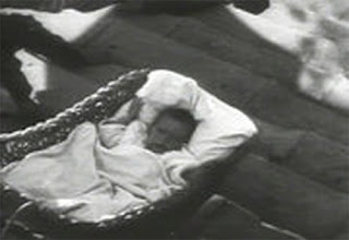
In a nutshell it shows a baby in danger. The author suggested an image of religious candles which comes from the story. I found this image of a baby carriage candle and thought it could be interesting. It alternates between being bizarre/cute/scary all at the same time.

(February 19)
Publisher liked the direction but felt it was too pretty and not edgy enough. She also suggested adding more colour to make it pop. I also introduced another dimension to concept by having the candle melt in stages.


The Manly Modern
Christopher Dummitt
Two color covers are always a challenge. I like to avoid using a straight duotone whenever possible and find a creative way to use the second color - red in this case.

Two color covers are always a challenge. I like to avoid using a straight duotone whenever possible and find a creative way to use the second color - red in this case.

Eau Canada
Karen Bakker
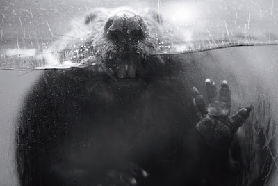
I found this image of a beaver on one of my searches for stock imagery and I couldn't get it out of my head. When this cover came up dealing with Canada's concerns over potential water exports to the United States, it seemed like a perfect fit.


I found this image of a beaver on one of my searches for stock imagery and I couldn't get it out of my head. When this cover came up dealing with Canada's concerns over potential water exports to the United States, it seemed like a perfect fit.


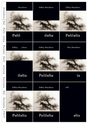
Palilalia
Jeffery Donaldson
This is a poetry cover that I just finished this morning. According to the Oxford English dictionary, palilalia is a vocal tic that is “an involuntary repetition of words, phrases, or sentences.” The covers shows 9 covers or partial covers within a cover. The spine shows the title “Palilalia” repeated as well.
The poet supplied the tree-like image and really wanted it to be used on the cover. In and of itself I didn’t think the artwork was very strong for cover art, but used in this manner it works.

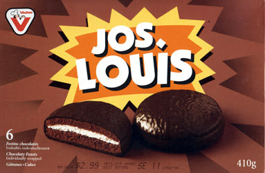
Jos. Louis
This was one of the last projects I worked on before focusing on book cover design about 10 years ago. For those of you who don’t know Jos. Louis has an almost iconic status in Quebec, so its redesign was a big deal. I keep this posted on my office wall as a reminder not to take myself too seriously.

Towards North American Monetary Union?
Eric Helleiner
For you Americans who might not know, the Queen is on the flip side of our penny.

For you Americans who might not know, the Queen is on the flip side of our penny.

Genetically Modified Diplomacy
Peter Andrée
I swear I could write a dissertation on two color covers. In this case black and yellow. I asked publisher to try and spring for 3 but it wasn't in the budget. In the end I don't think you would guess that it is two color. The concept shows two seemingly identical kernels of corn but one is GM and the other is not.
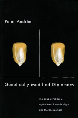
I swear I could write a dissertation on two color covers. In this case black and yellow. I asked publisher to try and spring for 3 but it wasn't in the budget. In the end I don't think you would guess that it is two color. The concept shows two seemingly identical kernels of corn but one is GM and the other is not.

Some Family
Don Akenson
The book is about the Mormon genealogical project and their effort to weave into a single narrative, person-by-person, every human being who ever lived. The cover shows a family tree chart ending up on a slightly worn living room couch.

The book is about the Mormon genealogical project and their effort to weave into a single narrative, person-by-person, every human being who ever lived. The cover shows a family tree chart ending up on a slightly worn living room couch.

This is a rejected cover photo montage I did for an upcoming book on the history of vegetarian thought. It would have printed 2 colour. Even though it was off the mark for this title I still like it.

Below are the different components that went into the montage – the animal heads and room shot. All images from Shutterstock.


Below are the different components that went into the montage – the animal heads and room shot. All images from Shutterstock.


Red Ledger
Mary Dalton
This is a recent poetry book cover. I was actually searching for a completely different image for this cover and happened upon this black and white medical illustration. Adding the red to the veins made the connection with the title.
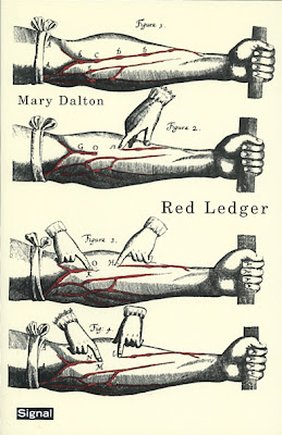
This is a recent poetry book cover. I was actually searching for a completely different image for this cover and happened upon this black and white medical illustration. Adding the red to the veins made the connection with the title.


Back from Holiday
On the way back from Rhode Island yesterday I passed this Motel sign in Saratoga Springs - couldn't resist.


Communication Arts Design Annual 2009
This series got selected for the 2009 Communication Arts Design Annual.


Subscribe to:
Posts (Atom)


