Journal design


Kind of sums up how I feel every time I start a new cover design.


This is a novel about a wrenching divorce set in the late sixties. 


This is a visual for a book cover where the main character has an Audrey Hepburn obsession and has hundreds of photographs of her on his bedroom wall. 


The idea for this cover originated in discussions with my sister, the author.  She wanted the cover to convey this key part of the manuscript; “Gezerah: A rabbinical enactment issued as a guard or preventive measure; also a prohibition or restriction generally; from the root “gazar” (to cut; to decide). The term is especially applied to a negative ordinance which the Rabbis instituted as a guard or a fence (“geder”) to shore up a Biblical precept.” Below is the photo I took to base the illustration on.


I just finished this logo for a trattoria located in a small village between Owl’s Head and Jay Peak in rural Québec. The village is known for its three churches – les trois cloches.


Another one for the Salon des refusés. They asked for a goat on the cover. I really liked the idea that the hand and shadow don’t match.


Turkish edition of Soldiers of Salamis, a novel about the Spanish Civil war.


Comps for a journal cover I am working on.


Hit the Road Jack

Essays on the Culture of the American Road

Only stipulation was to put a goat on the cover.


They wanted this cover to be a riff on vintage jazz album covers.


From the brief: “The book is organized around the series of poems about various grey totes belonging to different members of the poet’s family. It is a collection of elegies on the death, in quick succession, of her father and mother - lessons in goodbye, she calls them. ”
Visual for a cover about a love affair in a Hollywood studio during the silver screen era.

Recent cover for a Turkish publisher I just started working with. Title translates roughly as “the faster I go the less I have”


This is the final cover for this book by the brilliant Josh Freed. The option with the skull below was my first crack at it.


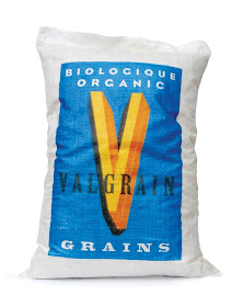
Valgrain

Ok so it’s not a book cover but how many designers can put “feed bag” on their resumés. Most feed bags are just one or two colours, badly printed with a generic cow or chicken graphic on them. Living in farm country I have seen a lot of them. The printer we used for this job started off by saying that rubber printing plates would have a hard time fitting the coloured sections together without gaps occurring, but in his hesitation to say “absolutely not”, I saw an opportunity. It took a whole day on press to get the registration right and in the end it really paid off. I love it when a printer is up for a challenge.
I started off with the banana option below but felt it was a little too cute
and maybe trying too hard, so I put it aside and went for more of a typographic approach. 


I kind of liked the middle one but the feeling was that it was too cartoony so I gave it a more graphic approach.


Another one from the salon des refusés from a while back, that I came across doing my yearly archiving.

The homicide detective in this novel suffers chronic debilitating pain in his arm from a previous gunshot wound. As part of his rehabilitation he takes up playing the banjo.


The hand drawn type for this cover is based on a photo I took of the menu board from a restaurant (below). It was the wavy stroke on the bottom of the “L” and the "E" that really caught my attention.
Recent cover with supplied art below.


Book 4 in this series.

This was an initial illustration for the 2nd volume - we opted for a landscape in the end.

The Nearly Complete Works of Donald Harington Volumes 1-3.

If cows could write, what would they say? The Golden Book of Bovinities distills the accumulated wisdom of centuries of bovine self-awareness.